Pattern Pulp

Trend: Sweet and Savory Details


motoi-yamamoto1

No matter how detail oriented you are, Motoi Yamamoto will still beat you to the punch.  Using salt and an extraordinarily steady hand, this Japanese artist merges organic influences with the most basic of natural elements, salt, to his build his masterfully intricate installations. Yamamoto’s work has progressed from an inquiry on death to the exploration of salt as a meditation on life. “Now I believe that salt enfolds the memory of lives…salt is used across culture as an antibiotic, preservative, and purifier.  Salt is a life-sustaining element.”  For the full story on Yamamoto’s work, pick up a copy of this month’s  Theme Magazine– unfortunately the online version omitted the story.

bantjes-cartier

It doesn’t take long to see techniques reinterpreted and trends take hold when an artist gains global acclaim. Using sugar in place of salt, Marian Bantjes, a typography genius, illustrates a variety of styles for Stefan Sagmeister’s book, Things I have learned in My Life So Far.  Infusing a touch of luxury to this trend, Cartier crafts golden fingerprints for thier latest ad campaign, Trinity, which can be found in Time magazine’s April supplement entitled, Fashion’s New Attitude.

Fashion: Mandatory Headgear


nutcase-helmets

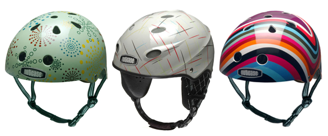
I’m not really an extreme sports kinda girl. Every time I take my bike out for a ride, the only thing that stops me from returning it to the bike room is the fact that a protective path leads me to Bleeker Street and a helmet is covering my head.  Imagery of taxi doors opening and tourist collisions are on repeat until my destination’s been reached.  Neurotic perhaps, but appropriate for an accident-prone city like New York.  Finding cool headgear to match my “coffee and muffin” bike hasn’t been easy, though the designers at Nutcase, have certainly presented fashionable options. Borrowing from the snowboarding aesthetic that made companies like Burton and 686 popular, Nutcase speaks to the creative loudmouth with their bright and playful designs.

ateliersruby-helmets

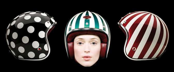
Les Ateliers Ruby caters to the fashionable motorcyclist or vespa enthusiast. Using glossy photography and a gorgeous subject matter, this French helmet company has certainly earned it’s place in the luxury sector.

velorbis-bike-accessories

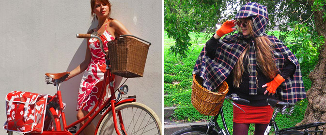
Though this post is primarily dedicated to headgear, I’d be neglecting the purpose of Pattern Pulp if I let these two examples slide.  Velorbis of Denmark is known for their beautiful (and practical) product offerings.  Using an all-over Japanese floral, this Pannier makes me wish I had more to carry on my daily route.  In an effort to disguise her helmet while still appearing chic, Shelly from Riding Pretty designed this Sherlock cape and hat combo, a creative adaptation to the oddly famous Snuggie.

Pop Gadget


I’m thrilled to announce that Patternpulp was recently featured in Pop Gadget, a leading lifestyle weblog on female innovators in the tech world. Hitting topics from the economy to future growth, the article highlights the role patterns play across all creative mediums in today’s marketplace.  Check it out here!

Trend: Window Stories


peter-jensen1

Windows are symbolic of many things.  For the poetic bunch, they emote hope and a one way ticket to the soul.  For the voyeuristic crowd, each window reveals a hidden story emerging at sunset.   In recent months, window patterns have been popping up throughout textile and home categories. UK designer James Nash conveys this through his t-shirt graphic entitled House, where type and structure become one.  Illustrating a curious overview of an apartment building at dusk, fellow Brit, Peter Jensen brilliantly merges upscale fashion with the banalities of daily life.

window-collage
Aino-Maija Metsola’s Mökki kitchenware patterns are an abstract snapshot of life along Finland’s Porvoo River while Wood Wood’s eco-graphics promote bare-bones living for the fashion forward. Collaging recyclable paper, The Sukie Journal recreates a Brighton city scape, while the MoMA store’s minimalist bird feeder takes luxurious shelter to another level.  This trend wouldn’t be complete without Matte Stephens‘ playful pillow illustrations that can be found at Urban Outfitters.

Interview: Geoff McFetridge


geoff-mcfetridge1

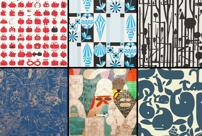
Geoff McFetridge is a true design pioneer, not to mention a wicked multi-tasker.  “He is part of a new generation of designers who are eager to leap the old divides between image and product, design and art, the flat page and the moving image,” says Paul Thompson, director of the Smithsonian’s Cooper-Hewitt, National Design Museum.  Patten Pulp caught up with McFetridge to talk about his design process, as well as Pottok, the wallpaper company that he founded with his wife Sarah.  Pottock marries McFetridge’s unique pattern skills with environmentally-friendly papers and water-based inks.  The abstract and breathtaking results have papered walls from The Montalban Theater in Hollywood to the well-known Colette boutique in Paris.  Check out our Q+A for a glimpse into the mind of this skateboarding wunderkind.

*            *            *

PP: What websites do you generally start your day with-do you have a  daily routine for news/blog/information consumption?

GM: I listen to npr for news. Friday Saturday Sunday we get the New York Times. If there is a site I check in the morning it is probably Cycling News, then Velonews. I take in a lot of useless cycling information.

PP: How did you discover your talent and how has it evolved over your career?

GM: I liked to draw as a kid. I liked to draw more than almost anything.  It was not important if I was talented, I drew so much that I was bound to get good. I still improve. I look at work I did a few years ago and notice how much better my new work is.

PP: Do you discuss your work with other designers?  If so, how does that impact your creation process?

GM: I am not very connected with other designers. I have an assistant who I bounce most things off of. He is a designer, and has different but similar tastes to me, so that helps. When I need to pull out the big guns I show things to my wife, Sarah. She runs Pottok and has a cold eye for quality.

PP: Where do you usually work on your patterns and what is your preferred method of creation + execution?

GM: Everything starts as handwork. All work I do starts as sketches and notes to myself in large coil notebooks. I then start to draw out some actual forms on loose paper. A lot of the designs defined by how they are made.  Almost every pattern I do I approch differently. One is made out of paint that I dripped on a board and then turned into a forest. A few are based on intricate drawings. The repeat for these was worked out with abstract shapes on the computer, I then drew the complex drawing over the repeating design so that it would repeat properly.  A lot of the most popular designs are very graphic. Those designs are drawn entirely on the computer. This is a process of drawing, tracing, and printing out in order to get things right. The final step of the process is either hand cutting film or getting the film output.

PP: When is the last time you took a professional/creative risk?

GM: I think that most days I take a little risk. Every project I accept I consider a risk. I am such a small studio (me and an assistant) that I have to chose projects and shows wisely. I do not have a lot of time to waste.

Creatively? I feel like I challenge myself by constantly adapting and developing my style. I rarely go for what I know works well. That is a type of risk, not exactly a risk, but maybe not totally playing it safe.

PP: Do you incorporate commercial trends into your work and if so, is this a factor that drives your design?

GM: No. My work is generally based on other work I have done, its an evolving process.
geoff-mcfetridge2

Bargain Basement Wallpaper Solutions


anthropologie1

When times are tough, retail environments pull out all the stops, forcing their design teams to get crafty in lieu of spending big bucks.  Sometimes these ad hock compilations are miserable collages and other times, wondrously creative ideas emerge.  Anthropologie’s artistic displays typically fall into the later of the two categories.  Inspired by Parisian wallpaper styles, the back wall of the retailer’s Fifth Avenue location pairs kitchen wares with floral chalk panels.  Using a $10 can of blackboard paint and a steady hand, Anthro’s budget illustrations are incredibly chic and can easily be translated to any wall in your home.

Inspiration: Floral Striping

floral-striping

When designing floral striping, all inspirational elements must be considered.  Here is a mood board that combines paralleling themes through the use of nature, Parisian craftsmanship and modern techinique.

Tracking Repetitive + Awesome.
On Instagram.