Pattern Pulp

Interview: Åsa Dahlbäck


asa-dahlback1

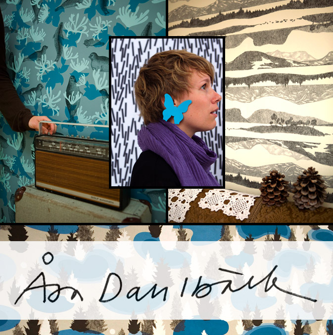
Åsa Dahlbäck is as calculated as she is original, particularly when it comes to pattern making.  Born and trained in Sweden,  Dahlbäck brings her design expertise and knack for reinterpretation to Lula, a multi-disciplinary art and design studio based in Gothenburg, Sweden. Her patterns are often nature-inspired and possess a graphic flair that incorporates relevant iconography.  “The patterns are built from what I find characteristic for the different (local) provinces,” a consistent theme throughout much of Dahlbäck’s portfolio.  Check out our Q+A for a glimpse into her daily design routine.

*            *            *

PP:  What websites do you generally start your day with-do you have a daily routine for news/blog/information consumption?

AD: I start my morning by reading a Swedish newspaper site and when I need a break and something beautiful to look at I usually visit my friend Elisabeth’s blog. Her photographs make my day sunny.

PP:  How did you discover your talent and how has it evolved over your career?

AD: Talent is something very abstract. For me it has been about allowing myself to do what feels natural for me.  This is still the case and probably what drives me forward.

PP:  Do you discuss your work with other designers?  If so, how does that impact your creation process?

AD: When I’m into something I can be a bit introvert. This is something I try to change, because I want to share my process and I know the result is always improving when I invite others.

PP:  Where do you usually work on your patterns and what is your preferred method of creation + execution?

AD: In the sketching process I try to have a variety of different methods going on at the same time. Pen and paper, using scissors to do cutouts, computer drawing and photographic collages. I mostly work with a chosen theme where I combine stories with different forms of sketching.

PP:  When is the last time you took a professional/creative risk?

AD: When I feel I’m taking a risk I know it means I’m doing something different from the last time. I try to welcome and stay safe in this feeling, because it usually leads me in a new direction.

PP:   Do you incorporate commercial trends into your work and if so, is this a factor that drives your design?

AD: I can’t say it drives my design, but it usually affects me in one way or the other. Trends usually say something about the time we live in and my curiosity for what’s going on around me is probably colouring my work.
Fashion: Surrealist Hares


bergdorf-ainomaijametsola

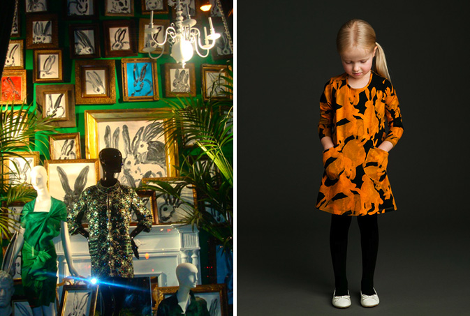
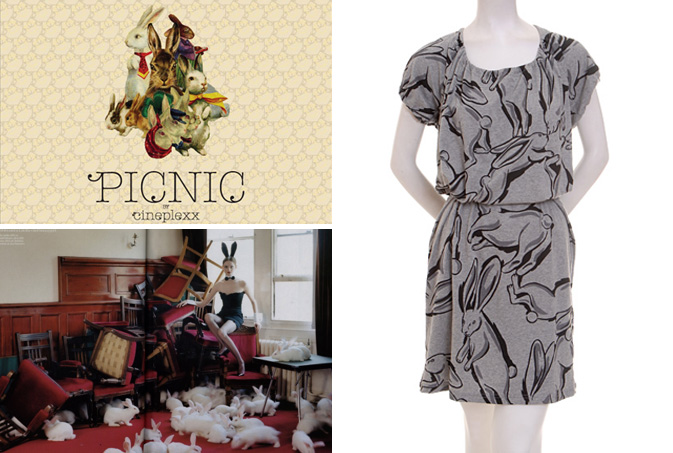
At the first sign of spring, bunnies start to emerge. This year’s been no exception, as countless prints and mediums have shared the unifying theme often associated with Easter.  The 2009 trend has appeared to take a refreshing left turn away from the usual pastel cuteness.  As seen in Bergdorf Goodman‘s windows last month, sophisticated gilded frames balance loose contour bunny portraits.  Jäniksen Vuosi’s rabbit toss for Marimekko‘s Autumn 09/10 collection presents a playful overlay of translucent silhouettes.

rabbits2

Cineplexx Picnic, a photo and design project by Pattern Pulp favorite, Alan the Gallant, collages rabbit profiles for the cover of their European music album.  Combining fantasy photography with real life story telling, Tim Walker’s UK Vouge photoshoot embraces the ideas of fertility, sexuality and femininity with the use of color, layout and subject matter.  Translating these surreal storylines into wearable fashion, Eley Kishimoto creates a dali-esque toss with leaping rabbits frozen in motion.

Follow-up: Armed with Asymmetry


terrypoison-maayangoldman

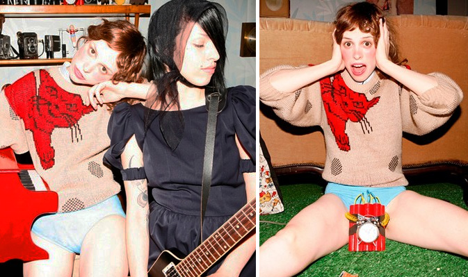
Israeli stylist, Maayan Goldman is a genius at her craft.  Combining juvenile detailing with playful sex appeal, her outfits for the Tel Aviv based girl band, Terry Poison are as eye-catching as they are inspiring.  Showcasing an asymmetric feline intarsia, this sweater is reminiscent of the garments created by Ashish, Marc Jacobs and Comme de Garcon.  For some background, click here for Pattern Pulp’s March coverage.

Trend: Digital Dividers


gordinjen-oumi

Digital influences are everywhere- from Invader’s pixelated street art to fashionable home goods and clothing themes, typically invisible details are gaining recognition across non-digital platforms.  Dutch designer Nienke Sybrandy‘s sheer curtains are a coder’s delight. Her tree branches are compiled of assorted letters and numbers and are laid out within a monochromatic palette.  In an alternate world, the LA designers behind the Oumi label have embraced this fashion friendly fusion by pairing transitory pixels with satin and knit.

kashiwasato1

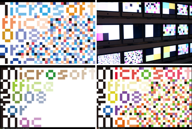
When assessing which patterns are most successful, it’s important to consider the role of color.  If a palette isn’t balanced, the eye will wander to the dead spots or over accentuated details.  These pixelated animations by the Japanese design team, Kashiwasato display type and movement for Microsoft Office’s 2008 for Mac launch.  Carefully choreographed squares cover the screen in chaotic movement, revealing digital disarray reminicent of a visual virus.

Trend: Type Remix


type-remix

The assemblage of letters and words is fascinating.  As children, we create our own mechanisms to communicate, then hone our craft and cognition skills as we age.  In recent weeks, there appears to be a visual unraveling of this basic foundation for which our society functions.  The results have been playful, though somewhat symbolic of confusing times. “This reminds me of when you’re tongue-tied and everything you want to say becomes sort of mush in your head. Or when you think you know what you want to say but completely forget,” says Pattern Pulp contributor Emily Gup.  Marina Camargo’s falling content was recently spotlighted on Swiss Miss and presents a surreal image of lost typography.  In real world time, these matching typewriter chairs are a curious window display at the high-end vintage furniture store Adelaide, in the West Village of Manhattan.  In the gaming and digital corner, Morisawa of Japan has created the addictive character game, Font Park, where beautiful calligraphy can be formed by disfiguring character symbols.

bergdorf-moma

In higher stake markets, scrambled letters are also catching on.  Bergdorf Goodman’s March window display showcased a backdrop of mismatched letters behind highly stylized mannequins.  A few blocks south at the MoMA, the just opened exhibition, Tangled Alphabets presents León Ferrari and Mira Schendel’s combined work over the later half of the 20th century.  Ferrari and Schendel’s joint collection addresses language as a major visual subject matter, encompassing the body, voices, words, gestures and metaphors for naming and writing trends.  Back downtown on Mott Street, I Heart NYC’s store signage is a retail reminder of Camargo’s work.

[youtube=http://www.youtube.com/watch?v=toWFvXHghDk]

Camille Utterback’s Text Rain interactive art installation from 1999 is quite mesmerizing, not to mention amazing, considering the technology was fairly rudimentary ten years ago.  For an afternoon laugh, check out the Prudential game Falling Words, as it’s a marketer’s lighthearted stab at releasing negative thoughts that people rarely share.

Gifts: Marking Your Territory


futureperfect-crayonrings

It’s always a little tough finding gifts that are foolproof.  Unless instructed otherwise, I always try to go the creative route, as I love initiating artistic moments.  While at the home goods concept store, Future Perfect, in Williamsburg this past weekend, I stopped in my tracks at these ingenious crayon rings.  The chic pyramids come in a playful palette of primaries and can be coordinated with any wardrobe.  Doodling on the go just got more fashionable.

graffiti-longchamp

If you’re looking for a cheaper alternative to DIY fashion, check out Wishing Fish’s T-Shirt Graffiti, as it’s under $10 and a perfectly sensible gift for any child (or adult).  If you’re aiming for personable luxury, Longchanp offers a blank canvas for their signature Le Pilage bag, though I’d be worried about making a mistake with every mark!

Tracking Repetitive + Awesome.
On Instagram.