Pattern Pulp

Art: Wave Interpretations


waves

Reinterpretations of the wave are the norm every summer season, so in honor of the weather, we’re highlighting four artists and their unique approach to the surf.  Caitlin Hinshelwood, a textile designer and illustrator from the UK, explores nautical themes ranging from anchors and Hokusai-like waves to sea urchins and starfish in her 2D gouache creations. Riding a massive wave of foam (and irony), our hairy meets hip favorite, Alexandra Cassaniti, introduces her summer catalog, Summer Bummer, with a colossal, hovering, tooth-like swell.  Moving into the literary corner, Tamara Shopsin, a frequent illustrator for The New York Times, communicates political content using a googly-eyed shark fin in her effort to convey the art of political distraction. Using a similar blue and white palette, Geoff McFetridge expresses surf etiquette with his marker drawing, Your Wave, My Wave.

Color: Green and Graphic


green-mosaics

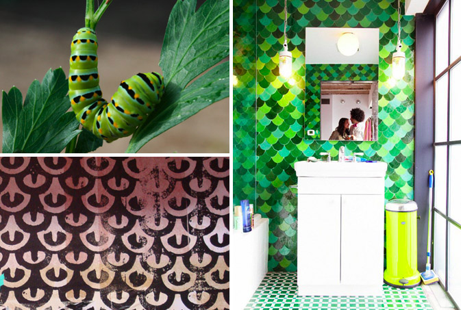
It’s common knowledge that nature inspires design.  When we saw this tomato worm on one of our favorite design and inspiration blogs, Lovely Morning, a few months ago, we knew that Summer ’09 was going to be both green and graphic.  The natural pattern found on this stunning caterpillar is visually connected to the beautiful tile work backing a shot of Kid America by the infamous photographer, The Selby.  We then found a black and white retail display at LA’s The Lab, that was distinctly reminicient of the scalloped mosaic.  Much like the caterpillar’s transformation to a butterfly, graphic design inspiration can evolve in equally magnificent ways.

Follow-up: Marketing the Disco Ball


discoball-pattern

As Lady Gaga’s fame rises, so does her love for all things flashy.  Beyond her dance beats and uniquely costumed performances, her devotion to the disco ball is a constant for most of her shows.  As we noted last month, the convergence of fashion and nightlife continues to intersect in the most literal of ways, spurning metallic fabrics for nighttime use as well as day.  This pyramid studded pocket, which we spotted on one of our favorite inspirational blogs, JBlyth, showcases two trends in one: hidden details combined with punk attitude- the perfect blend for a fashionable night out.

Quick Links: Weekly Notables


6-26wrapup1

1. Interview with illustrator Andy Smith, via Shiny Squirrel

2. Life sized camera obscura as wallpaper, via Design Boom

3. Ryz and COLOURlovers patterned shoe design contest, via Colour Lovers

6-26wrapup2

4. Moroso’s M’Afrique collection and other african/african inspired designs, via Yatzer

5. Furni’s artist enhanced clocks, via If It’s Hip It’s Here

6. Wonderful blackboard style packaging of Kaffe coffee shop, via The Die Line

6-26wrapup3

7. Modular light wall tiles give a stained glass effect to your work, via Yanko Design

8. Not your typical boutonnieres, via Design*Sponge

9. Interview with Phil Dunne, via Abduzeedo

6-26wrapup4

10. Some amazing street art up for auction at Paris’ Art Curial, via Arrested Motion

11. A collaboration between Missoni and Converse, via WWD

12. Beautiful modern prints and patterns from Cristina Londoño’s Wallnut
Studio, via Print Pattern

By: Emily Gup

Trend: Crayon Colored Balloons


balloons-dazed-confused-jo-goddard

Summer’s finally here and balloons appear to be the signifier of the season.  Be it literal or interpretive, pastel floaters have gained an inspirational edge, as it’s hard to resist a balloon’s youthful, colorful zeal.  Artists and photographers seem to be using balloons to convey messaging representative of our time, mixing hopeful optimism with realistic and momentary pleasure. Tiara Mia of Turkey has photographed an incredible layout, using a string of vibrant balloons to convey color, mood and atmosphere.  Dipping into the Vogue archives, Dolce & Gabbana have recently curated the exhibit, Extreme Beauty in Vogue, in correlation with the launch of their latest makeup campaign. This June 1949 photograph by Clifford Colin glorifies the swimming cap while reminding us of this familiar prop.

balloon-bunch

In conveying hope and wonder, Disney Pixar, Bloomingdales and Dior have all devised their own interpretations of the familiar phrase, “up, up and away.”

balloons

Sliding into the figurative realm, the Kyouei Design team of Japan reference balloons (as well as wine) with their “glass tank” prototype.  This light filled spectrum beautifully displays opaque and transparent qualities similar to it’s balloon counterparts, while this ampersand pattern from ffffound cleverly displays floating typography.

Additional contributions by: Emily Gup

Interview: Emil Kozak


Influenced by skateboarding culture, his homebase of Barcelona and a healthy dose of creative irony, Emil Kozak has become a leader of what’s relevant in today’s graphic market.  Devising obscure references through words, objects and codes, Kozak has produced artwork for clients ranging from Vans, Element, and Burton, to Nike, Lab Skateboards and Uniqlo. “I hope that my work can remind us that imagination can defy gravity and bend time.”  Kozak’s mantra is yet another example of trends in design bridging both space and time.  Check out our Q+A for a glimpse into the world of this vector wunderkind.

*            *            *

PP:  What websites do you generally start your day with?  Do you have a daily routine for news/blog/information consumption?

EK: I check the wave forecasts first thing when I wake up.  Sometimes I check the news, but usually i just get started on working.

PP: As a designer, how did you discover your talent and how has it evolved over your creative career?

EK: When i was a kid I was really into Lego and making things out of wood. At my parents house there is still all my homemade pinball machines, pirate ships and what not. When I got older, I started making tape-covers for mix tapes and the demo-tapes for our punk-band on the Xerox machine at my dad’s work. When I finished High School, my mom gave me the idea to try out a graphic design education. I did and was hooked.

PP:  Do you discuss your work with other designers?  If so, how does that impact your creation process?

EK: Yes, I have friends with similar professions and we always help each other out, when the eyes give up… It affects more of the final decision making concerning colorways or small variations. Conceptual work etc. is between my notebook and me 🙂

PP:  Where do you usually work on your patterns and what is your preferred method of creation + execution?

EK: First I sketch with pencil and paper. Then I scan and finish it on computer.

PP:  When is the last time you took a professional/creative risk??

EK: I guess I take small risks on a weekly basis, but the last major one was deciding to go freelance, and start up my own studio.

PP:   Do you incorporate commercial trends into your work and if so, is this a factor that drives your design?

EK: Sure, I’m just as much a product of my environment as anybody else.  Zeitgeist and the contemporary is a powerful thing. I actually think it’s kinda cool that we are all in this boat together somehow with shared beliefs and a collective consciousness.

Tracking Repetitive + Awesome.
On Instagram.