Pattern Pulp

Trend: Designing Frequencies


audiowaves-pattern

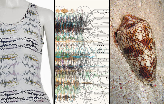
We seem to be taking our patterns back to the basics lately; finding new and interesting facets to things we see in everyday life — focusing on form rather than utility. Recently, we’ve been noticing an increase in the use of sound waves as a design element. With instant access to fresh new tunes served daily from music influencer sites such as RCRD LBL or Pitchfork, the general population has been able to “see” their music that was once invisible. Illustrating this concept in the most tactile of ways, Lorick’s SS ’09 collection romanticizes the audio file, while this New York Time’s info graphic proves that chaos and structure can be balanced with the simple use of argyle. This cone shell forces us to acknowledge nature’s ongoing influence, making us ask- what came first the ocean wave or the sound wave?

Additional contributions by: Emily Gup

Quick Links: Weekly Notables


7-24-09wrapup

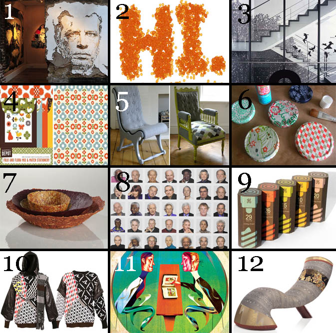
1. Alexandre Farto elevates street art while mastering his carving skills, via 30gms.

2. A showcase of nontraditional typography from HandMadeFont, via Abduzeedo.

3. Stunning and dynamic stairwell signage, via Kitsune Noir.

4. A preview of Chronicle Books fall paper collection, via Print Pattern.

5. Knit chairs by Melanie Porter, via Decor8.

6. DIY ways to use up your paper scraps, via Design*Sponge.

7. Interesting edible, biodegradable bowls made from vegetables, via Inhabitat.

8. The beauty of wisdom, multiplied, via If it’s hip, it’s here.

9. Top ten packaging picks, via The Dieline.

10. Patchwork jacquard sweaters from Bless and Oxbow, via High Snobiety.

11. Masters of retro modern design, via Colour Lovers.

12. Beautiful traditional kimono silks used as furniture upholstery, via Design Boom.

Compiled by: Emily Gup

Follow-up: Zip and Repeat


followup-zipandrepeat1

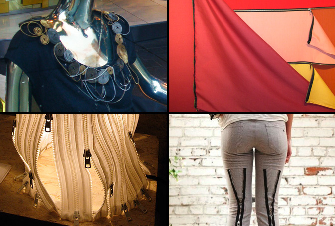
The zipper trend we reported on last month is revealing itself across the globe in fashion, fine art and furniture alike. From Catherine Malandrino’s zip applique collar to this brilliant malleable lamp featured at the Stockholm Design Fair, clever applications are finding their way into the design side of the creation process. In the southern hemisphere, Brazilian conceptual artist, Nielson Leirner covers large canvases with warm colored fabrics, which are delicately draped open with zippers. This example of the mundane is quickly forgotten though when designers add a punk point of view. Rag and Bone’s latest bondage experiment, as noted by New York Magazine, is the “skinny jean for fat days.”

BA coverage by: Rebecca Silver

Street Finds: Urban Palettes


urban-colorpalettes1

There’s no shortage of inspiration when you live in a city that celebrates beauty and revels the grotesque. Today’s highlight captures the natural colors around town that can be used as a source of inspiration.  From Vutera’s speakeasy neon lighting in Williamsburg, Brooklyn to this glass mosaic on New York City’s newest elevated park, The Highline, summer’s color combos are just as vibrant in nature as they are in city dwelling.

urban-colors2

This wall in Brooklyn speaks  to several months of messaging.  Once symbolic of a crumbling part of town, imagery such as this now serves as marketing inspiration for retailers such as Barneys and Urban Outfitters.  Veering away from the grunge factor, this doorbell and name plate from San Francisco’s Russian Hill district, is both an amusing display of typography and a beautiful combination of warm muted tones.

Additional contributions by: Emily Gup

Trend: Identity Crisis for an Online World


scattered-features2

The scattering of physical features is similar to how digital identities resemble a kaleidoscope – lots of colorful parts pieced together to create different patterns. We are constantly juggling multiple on-line identities which when built together illustrate who “we are.” It’s not hard to take a trip down the digital rabbit hole and become lost in a sort of Wonderland, a marvelous “imaginary” place where we experience a bit of an identity crisis. Imagery reminiscent of this theme has been popping up throughout the fashion world, be it in this Agent Provocateur military spread, this Dazed and Confused Beth Ditto cover, or as Diane Von Furstenburg’s signature lip toss. It’s like Alice in Wonderland where Alice grows too big and then too small and in a conflicted state exclaims, “I know who I was when I got up this morning, but I think I must have been changed several times since then,” as she struggles to answer the question, “Who in the world am I?”

scattered-features1

There are so many digital outlets for expression – video, photo, social networks, blogs, microblogs, mobile apps – that it becomes impossibly difficult to manage where our digital identities within these fields stand alone and where they merge and create hybrid channel identities. We ask ourselves, should I only tweet stories relevant to my work or career? Should my Facebook be just for friends or coworkers as well? I have three different blogs, so how do I distribute appropriate content and still manage to be “me?” At what point do I overwhelm my networks with repetition and duplication of thoughts?

One must ask where these identities overlap and weave together to write the story of who we are. And we’re not the only ones confused. Magazines are asking the same questions. Trying to find their place amidst a world that’s already started without them, they try to add digital value to their identities in an effort to temp users to pay for content. A few visual parallels of this are apparent in Bjork’s recent Interview cover, this Beautiful Decay photo collage by Bryan Schnelle, Katya Ford’s inspirational photography and this New York Times illustration by Fred Tomaselli.

scattered-features3

This investigation brings to light the question of how this splicing translates into our own expressive habits. Thinking about how our personal fashion and style is affected by our many influences, how do these digital personas add up into one fashion statement, one outfit? Or, does one just wake up and wonder, who am I today and which influence do I want to bring into the physical world? This Barbara Kruger piece entitled, You’re Not Yourself, illustrates this concept quite clearly, as does this Valium advertisement, where discomfort and instability are acknowledged in the decision making process.

As bilinguals, we look to the familiar, the iconic and seemingly unchangeable to make sense of the new and foreign. Acculturating into digital, we must examine physical pieces of ourselves in order to understand how to adapt in our ever-evolving world.

Compiled by: Kelsey-Lee LeGassick

Quick Links: Weekly Notables


7-24wrapup

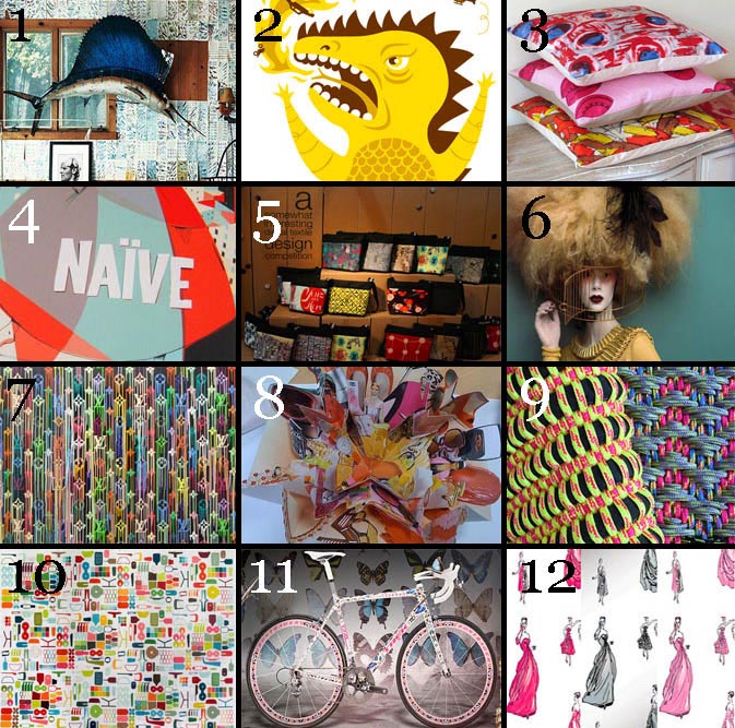
1. Personal DIY wallpaper, via Design*Sponge

2. Interview with illustrator Tad Carpenter, via Shiny Squirrel

3. Pillows made from vintage silk scarves, via Decor8

4. An exciting peak inside  “Naive – Modernism and Folklore in Contemporary Graphic Design,” via Print Pattern

5. Extensive and fun look at some of the offerings from the Design:Made:Trade and Designboom Mart events in Melbourne, Australia, via The Design Files

6. Color palettes from Paco Peregrin’s bold  photos, via Colour Lovers

7. Vibrant woven indoor/outdoor textiles from Angharad McLaren, via Moco Loco

8. Interview with paper artist Benja Harney, via Inside Out

9. Liquidated logos, via Design Boom

10. Puzzle Rug outfitted with subtle silhouettes of BarberOsgerby products, via Kitsune Noir

11. Damien Hurst’s butterfly bike for the Trek bike series, via High Snobiety

12. Legendary Cecil Beaton’s sketches are being turned in fabrics and wallpaper, via If it’s Hip it’s Here

Compiled by: Emily Gup

Tracking Repetitive + Awesome.
On Instagram.