Pattern Pulp

Friday Quick Links!


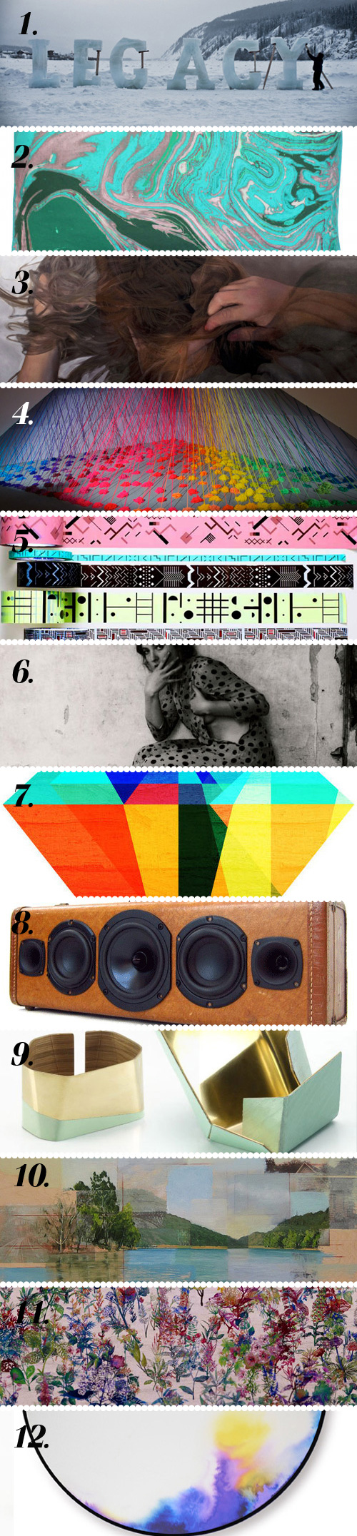
  1. 1. Interesting ice typography by Nicole Dextras via Little Paper Planes
  2. 2. These pillows by Kevin O’Brien are pretty amazing via design*sponge
  3. 3. Pakayla Biehn’s stunning paintings are derived from double exposure photography via Honestly WTF
  4. 4. Oodles of rainbow yarn in Lee Baker’s “Refractive Monolith” installation via Plenty of Colour 
  5. 5. Peter Nencini’s patterned packing tape is right up our alley via Design for Mankind
  6. 6. Love these haunting photographs from Francesca Woodman via My Love For You
  7. 7. Geometry inspired jewel prints from Tabitha Bianca Brown via The Audacity of Color
  8. 8. Swooning over these “Boomcase” vintage suitcase stereo systems via Poppytalk
  9. 9. Digging the sculptural shape and two-toned jewelry of Juhos Janka via Miss Moss
  10. 10. Lovely painting by Ryan M. Reynolds via booooooom
  11. 11. Zadok Ben David’s gorgeous steel-cut flower installation Blackfield via This is Colossal 
  12. 12. Smitten with these fantastical watercolor mirrors via My Adventure is Your Advantage 

Coverage by Emily Gup
 

Twitter Influencer: Blaine Fontana


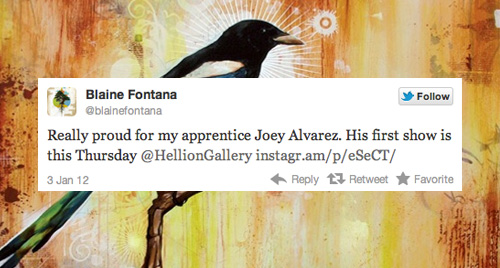
Portland based designer and illustrator Blaine Fontana imbues his work with the divine symbolism of religious myths, worldly folklore and current social dynamics, and considers his work a kind of shamanic exploration of meaning that recognizes the totemic quality and power of the image.

With extensive experience in the design world, including working for Felt Bicycles and acting art director for Zero+ Publishing, Fontana’s work displays a virtuosic understanding of sign & simulacra in contemporary visual culture.

Following Blaine on twitter, it’s easy to sense what a visual person he is, frequently attaching photographic and video media to his commentary. We love getting a first hand sense of his love for art and design, and his enthusiasm for sharing the work of other talented artists he admires.


Creativity in Shanghai


[slideshow id=30]

Here’s the next batch of photos from my Asia trip- a few favorites from Shanghai! After leaving my brother-in-law in Hong Kong, my husband and I met up with our friends Mari and Naveen, who were also traveling from New York.

As you’ll see, there was a stark range from high to low throughout the city, but overall Shanghai was expansive (think Chicago, Boston and New York in one) and overwhelming to traverse. The people were friendly, the news highly censored, clothing was hanging from every window and the LED screens were super-sized. Here’s a mix of food, fashion, art and random observations along the way.

Imagery by Myself & Mari


Trend: Dotted Chaos


I’m a fan of circular symmetry just as much as the next designer, but when it comes to free form chaos, it can be really refreshing to just let loose. David Huffman’s done just that within a topographic landscape for Floating World #1, his mixed media on canvas piece that’s currently on display at the Patricia Sweetow Gallery.

Applying a similar layering technique with an explosive saturated palette, Yayoi Kusama’s latest project is just as eye-catching.

Pairing a white room with stickers and children, organized chaos creates a living, breathing installation.

The full pictorial set can be viewed on This is Colossal. It’s worth a visit, as the process is a nice reminder that beauty often has a singular focus.


Book Review: Precursor & Tatyana


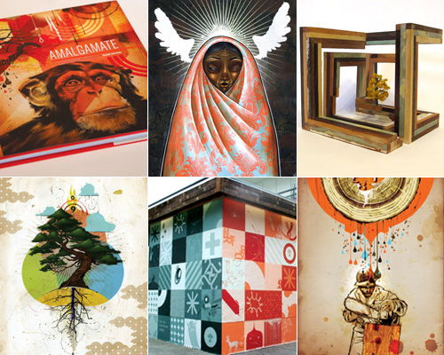
On my most recent trip to Japan I made my way out to Daikanyama, an indie pocket within Tokyo where a new bookshop recently opened. The visit was pretty memorable, as the establishment known as Tatyana was an interesting spin on the brick and mortar institution of literary commerce. With impecable curation, decor and ambiance, people are already saying this institution sets a new industry benchmark. One of the books I lost an hour to was Precursor.

The compilation showcases a vast array of young designers moving fluidly between established creative titles. From graphic designer and advertiser to street artist, video director, typographer, illustrator, product designer, and musician. Despite or because of the way they work, they are profoundly innovative and remarkably determined at realizing their creative visions and personal style.

Precursor introduces outstanding young design talent from around the world. Although regional creative differences and design traits still exist, the examples collected truly speak to the Patten Pulp aesthetic.

Imagery via edhv


Color: A Pop of Pomegranate


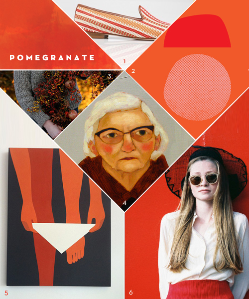
I recently stumbled upon the Geoff McFetridge print of the woman stepping into her bikini, and became mildly obsessed. (Geoff, call me, I need it.) It’s bold, graphic and semi-risqué, but the combination of orange and red was what really stuck in my brain.  Maybe it’s the cranberry sauce or the turning leaves (or the chilled, rosy cheeks in Kate Pugsley’s paintings), but this color combo seems custom-made for the season change. In an attempt to recreate it, I tried to make Amy Merrick’s wreath while in Cape Cod a few weeks ago. Let’s just say that ship never sailed.

*            *            *

1. Galo Loafers  |  2. Matthew Korbel Bowers  |  3. Amy Merrick Wreath  |  4. Kate Pugsley Oil Paintings  |  5.  Geoff McFetridge and Heath Collaboration  6.  Andrew Nuding Photography

Coverage by Valerie Gnaedig


Tracking Repetitive + Awesome.
On Instagram.