
Squat, geometric and beautifully assembled, we have Matthew Fairbank and Suki Cheema’s recent collaboration. Mirroring similar modular themes, realized through wood and fabric, this collection’s a refreshing take on a familiar home item.

Squat, geometric and beautifully assembled, we have Matthew Fairbank and Suki Cheema’s recent collaboration. Mirroring similar modular themes, realized through wood and fabric, this collection’s a refreshing take on a familiar home item.
Coverage by Emily Gup
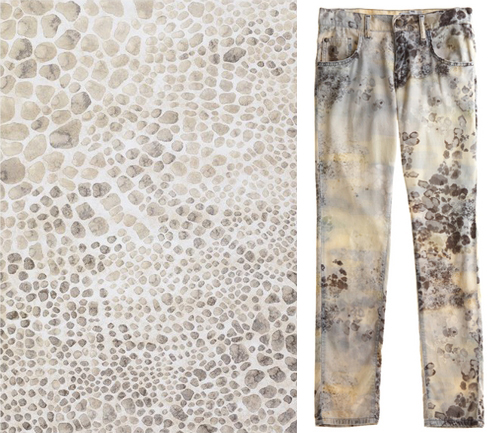
Who else gravitates towards watercolors? Yes, color blocking and graphic edges are great, but when a 2D surface has all the elements of 3D nature, the print can be truly unique. The rug on the left is made in Belgium by Couristan and is part of The Everest Collection. The Italian corduroys on the right resemble a summer lake bubbled with algae, in a good way, and is on sale at Calypso.

Berlin-based (Iceland born) Siggi Eggertsson’s favorite hobbies as a child were drawing and computers. He later realized he could combine these two passions with graphic design and at 18, moved to Reykjavik to attend the Iceland Academy of the Arts. While he received a good deal of success as a graphic design student – including acknowledgments by Print Magazine as one of 20 brightest design stars under the age of 30 – his interests shifted to include illustration and custom typography.
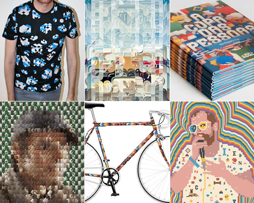
Eggertsson’s portfolio of work is nothing short of expansive and innovative as he manages to effortlessly combine color, texture, typography and old-school digital influences. Presently, he splits his time between commercial and personal projects and has started running a workshop in addition to writing and lecturing. Twitter is a great place to stay abreast of this colorful character, as he shares his latest projects and glimpses into his thought processes and life, as well as, of course, the occasional amusing animal video.

For those of us who’ve been out of (art and/or design) school for a while, living and working in our modern world where we’re confronted with constant image and info overload, it’s not hard to miss the days when we were encouraged to step away from our best judgement and stretch our creativity to the limit. Draw It with Your Eyes Closed: The Art of the Art Assignment presents 100+ art assignments, anti-assignments and artworks from both teachers and students from a broad range of institutions. The book is sure to get your creative juices flowing, inspiring original thought processes and work, as well as serve as an archive and record of the evolving oral tradition of the art assignment. Not just for artists and designers, this is a great book to give any and everyone’s brain a little creative push.
Get going with this excerpt from the book!
Color Walk
Take a color walk. Give yourself at least one hour of uninterrupted time. Do not plan your walk in advance or combine it with other activities (commuting, shopping, etc.). Try not to talk or interact with other people during this time. You will not need to bring a cell phone, journal, camera, or iPod. You will not be graded or evaluated on your color walk.
You can begin your color walk anywhere. Let color be your guide. Allow yourself to become sensitized to the color in your surroundings. As you walk try to construct a color story or a narrative based on color you observe. What are the colors that you become aware of first? What are the colors that reveal themselves more slowly? What colors do you observe that you did not expect? What color relationships do you notice? Do colors appear to change over time? We will discuss the color walks in our next class.
—Munro Galloway

We are taking just a slight detour this week and going from peach to clementine. What’s the diff? Who cares? Clementine is a brighter, warmer color than its airier peach counterpart. It’s a color I rarely use or see in design work, especially web design, but when it’s used right it is powerful and stops me in my tracks. I was recently struggling to find the perfect arrow color for a mainly black and white site and somehow this clementine color was the perfect fit. Clementine is the new black? Doubt it, but it sure is a good secret weapon.
* * *
1. Patina Identity by Mucca | 2. Elephant Magazine by Studio 8 | 3. Florida Citrus Bouquet by Amy Merrick | 4. Clementine Summer T-Shirt | 5. Carrot Juice | 6. Miu Miu 1994 Spring Summer
Coverage by Valerie Gnaedig