Pattern Pulp

Kaleidoscope Collage with Josh Goot


Credit where credit’s due. I like Moda Operandi‘s emails. From the curated merch, the  large descriptive photos and the fact that the curtain’s been lifted on the pricing (from a simple curiosity factor). I usually dissect every image, even if only for a moment. This brings me to Josh Goot.

A few weeks ago, his Spring/Summer collection was featured. It was screen shot heaven- everything about his classical meets modern collage merged with a neon and metallic palette made his prints extremely memorable. While the kaleidoscope and photo realist technique’s been around for a bit, Goot’s interpretation feels fresh and I’m a fan.


Breathing Life into Your Infographic


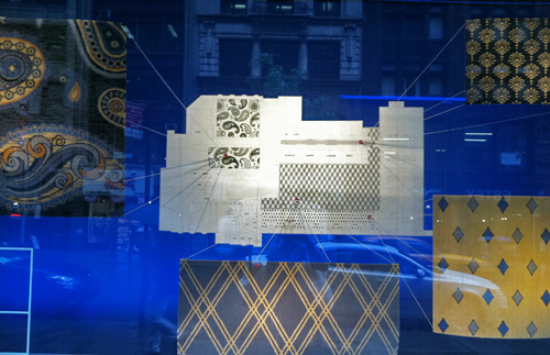
Check out this window on Madison just north of Eataly. I’ll admit it’s not my best street shot, though the concept’s interesting. In an effort to demystify a 2D floor plan, carpet swatches and string have been added to provide dimension, color and texture. It’s a valiant effort, and I’d love to see a few more interpretations.


Drawings from Burma


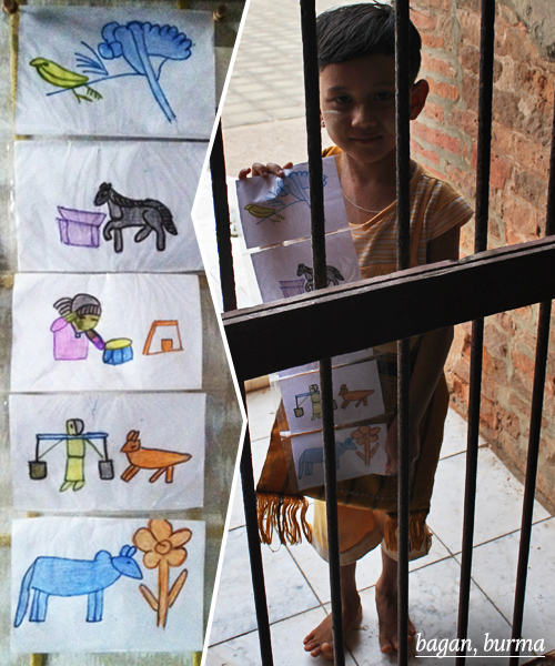
Officially back from two weeks of incredible travel. As I sort through priorities and start playing a wonderful game of catch up, I figured I’d share an illustration that came home to New York with me. Every time I visit a new place, I like to buy art from the region and this was a very special find from Bagan. Many of the children sell postcards of pre-printed photos by the pagodas. This boy made his own interpretation. Regardless of where you go in the world, children’s drawings are unfiltered and universally special. What do you collect when you travel?


Life Advice from Stefan Ruiz


I recently picked up a copy of Elephant Magazine, and lost hours of my day in a coffee shop glued to the editorial. Ana Inarra’s interviews are particularly interesting. Here’s a small excerpt from her Q&A with photographer, Stefan Ruiz. As a freelancer, I can relate to his response and believe many of you will too. Here’s an excerpt, you can read the article in full here:

…I prefer working on personal projects for the obvious reason, but finding a balance is difficult. There are constant interruptions. I often have to stop everything to go off on a job. It may take me weeks or months to get back to what I was working on before I went away.

I do commercial work to support myself and to fund my projects. But that’s not the only reason I do it. I wouldn’t like to do only personal projects. Commercial work has given me a lot of access to people and places, and it has exposed me to things that I probably would have never seen…Also with commercial work you have time limitations and deadlines. This teaches you to focus and work fast. 

My personal projects can go on forever. I’m trying to learn from my commercial work about finishing things. And finally many of my personal projects have started from something that I was exposed to on a commercial job.

 

Friday Quick Links!


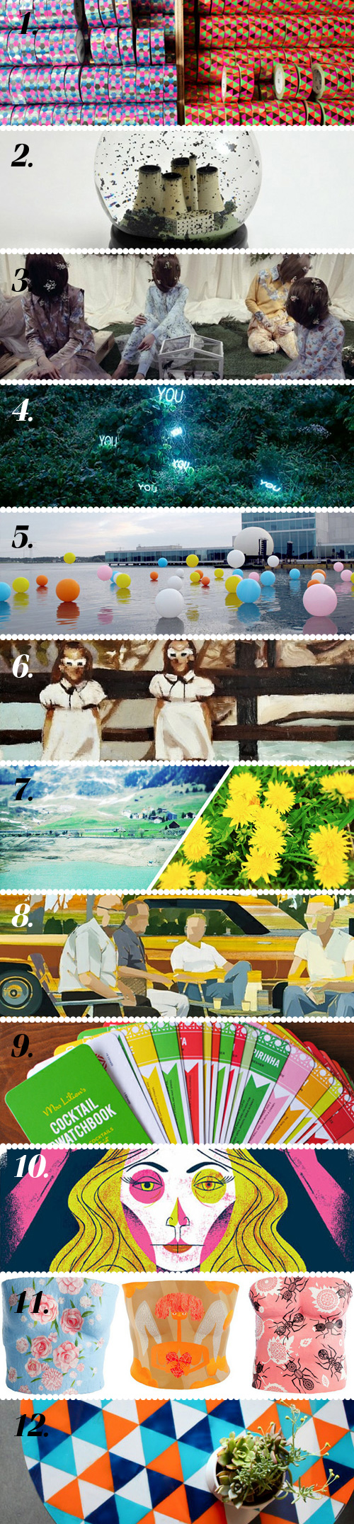
1. Japan’s mt tape factory is clearly washi tape heaven via Poppytalk
2. No Globes are snow globes that highlight climate change via Colossal
3. Flowers, flowers everywhere via Style Bubble
4. Loving these neon text installations by Lee Jung via booooooom
5. Love the effect of this LED light filled balloon installation via Plenty of Colour
6. Caitlin Doherty’s cheeky painted Polaroid’s via Trendland
7. An excellent guide to iPhone photo apps, complete with pretty pictures via Krisatomic
8. Digging these layered paintings by Signe and Genna Grushovenko via Artsy Forager
9. This colorful patterned cocktail swatch-book would be hard to turn down via Oh Joy!
10. Delightful posters by Anne Benjamin via designworklife
11. Plaster torsos to document women with breast cancer’s journey via Honestly WTF
12. Love this DIY painted glass tabletop via design*sponge

Contributed by Emily Gup

Twitter Influencer: Brie Harrison


Brie Harrison is the queen of whimsical botanical illustration. At age 12, she set out on a path toward fashion design and as time passed, she found herself equally interested in tex­tiles and print­ing. She went on to study Fashion Textile Design at Brighton University.

Harrison was asked to design a range of greetings cards and wrapping papers for the stationery company Art Angels in 2008. The project inspired her to become a freelancer and pursue her love of Illustration. Her work has appeared in Anthro­polo­gie, WGSN, Amelia’s Mag­a­zine, Blue Q and was recently fea­tured in Mike Perry’s Over and Over: A Cat­a­log of Hand Drawn Patterns as well as Charlotte River’s I Love Stationary, among others. Her inquisitive, charming and engaging personality shines on twitter, where she happily shares her inspiration and adventures while conversing with friends and fellow art lovers.

Additional information via Brown Paper Bag

Tracking Repetitive + Awesome.
On Instagram.