Pattern Pulp

Friday Quick Links!


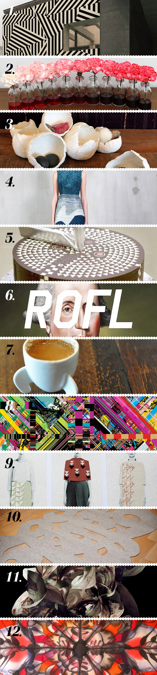
1. Outdoor wallpaper! via design-milk
2. Charmed by Jake Evans floral works via It’s Nice That
3. Lovely DIY paper clay barnacles via design*sponge
4. Beautiful & interesting textures from Natargeorgiou’s winter collection via Miss Moss
5. These patterns in chocolate are fascinating and look quite tasty via Jeannie Jeannie
6. Juxtaposing modern “text speak” with 18th Century portraiture via Empty Kingdom
7. Getting a giggle over these rocket espresso cups via swissmiss
8. A fan of these digital patterns by Atsushi Kuba via Pattern Bank
9. Textile designer Anna Duthie’s lovely collages via All the Mountains
10. Digging Jessica Hische’s DIY “type” rug via Jessica Hische
11. Striking new prints from Sougwen Chung via The Fox is Black
12. Stunning hand-painted silk scarves from Asta Masiulyte via Honestly WTF

Coverage by Emily Gup

Julia Pott


Julia Pott is an animator and illustrator with whimsical work filled with anthropomorphic animals expressing humorous human experiences. With a passion for hand-drawn creations, her creatures have a natural quirky authenticity. Her drawings are wildly popular and her animations have appeared in a variety of places ranging from a Toyota commercial to a Decemberists video. She received a BA in animation and illustration at Kingston University in 2007 and earned her MA in Animation at the Royal College of Art in 2011.

Some of her clients include: Bat for Lashes, The Decemberists, Casiotone for the Painfully Alone, Chronicle Books, Edun, Etsy, J. Crew, Malibu Rum, MTV, Picador, Picasso Pictures, Passion Pictures, Skins, Toyota, V & A

Circumsolar and Fragments of Dying Light


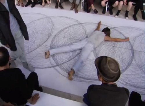
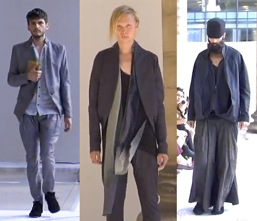
On a personal level it’s very exciting to share this video. We’re always rooting for our friends to succeed and when collaborations occur combining various parts of our past and present lives, it’s all-the-more charged. In this case, I’m completely blown away by the moving parts from Sruli Recht‘s SS2013 presentation, Circumsolar and Fragments of Dying Light which debuted in Paris in late June.

Combining the talents of his friends and colleagues, Recht’s show is scored by Nico Muhly and the live penwald drawings are by artist (and model) Tony Orrico. The execution is beautiful and a balance of complimenting components.

His menswear line feels appropriately Icelandic, using a natural palette and complex engineering- evident in the folds, fabric and draping. A commanding effortlessness, you might say, something we all strive for. Congrats to all involved!


Making a Farmville Set with Lesley Morphy


We all know Instagram’s pulling us into every corner of our friends’ lives. The immediacy of the photos and close perspective allows us to dip in and out of each activity, whether or not we’re actually there to experience it. So it goes with this latest post. I saw a stream of photos on Lesley‘s feed of her current project. As I’m known to do from time to time, I shot her a note and asked her to send higher resolution photos over so we could do a proper feature. Luckily for me (and you) she complied!
PP: So give us a little background, who was the client and what were you asked to do?

LM: So, FarmVille (of Zynga) and Serve (a stand alone brand of AMEX) recently partnered up and wanted to celebrate. It’s pretty exciting as it’s bringing digital money transactions to a new place.  And it seems like people are coocoo bananas for FarmVille- Zynga is a multi billion dollar gaming company!
PP: So how did the collaboration come about?

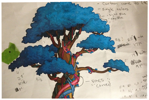
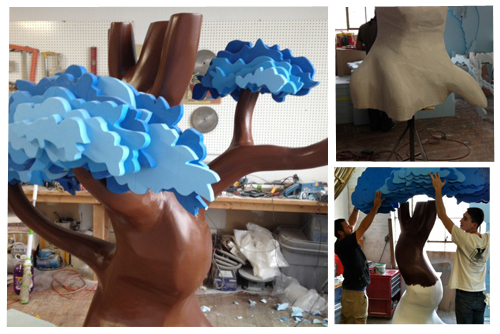
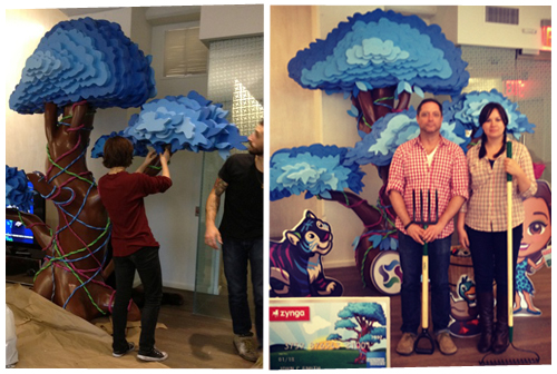
LM: I was approached by 1 Trick Pony to realize the launch in a creative way.  Being a 3D thinker, I really wanted to bring the game’s assets to life.  I played the game and it was easy te see that the MONEY TREE was the major asset. So I thought it would be fun to make it larger than life… 10’-6” tall x 7’-0” wide x 5’-0” deep. I also had a lot of fun propping it out with the game’s characters and a tickle trunk (a Canadian colloquialism for tv show Mr. Dressup’s trunk full of dress up clothes) of farm paraphernalia.
PP: What were your thoughts and initial inspiration with creative direction?

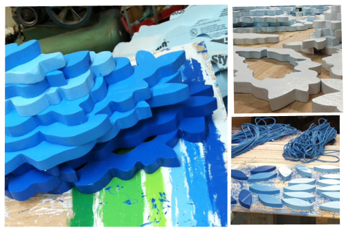
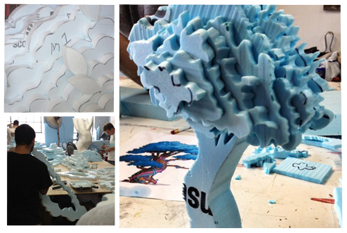
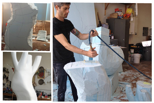
LM: I really wanted it to feel cartoon-like, as though it had literally been pulled from the game and placed in the Serve headquarters.  So it was important to build it in a fun way and for it to be glossy and cute. The biggest challenge was determining how to execute the cutouts; what materials to use; how to make the foliage playful; how to make the vines feel real; and getting the colors exactly right.
PP: What were some obstacles you encountered along the way?

LM: A major obstacle was getting it done within the tight deadline. There were many steps in the process- custom sculpting the trunk and hand cutting all the foliage, sanding, plastering, coating in resin and hand painting everything, including the vines.  Not to mention weather conditions affecting drying time and other kinds of unforeseen challenges, which didn’t help. Needless to say it was the 11th hour and we had a few volunteers (very good friends!) with paintbrushes and super glue helping with the final touches. (A couple bottles of wine might have helped with the volunteer effort!)
PP: And did it turn out the way you had hoped?

LM: The client was absolutely thrilled with the results. So much so that we are now in the process of building three more trees and shipping them to California, Florida and Canada! It’s no myth, money trees really do bring good luck and fortune!!

 

Twitter influencer: Christopher Bettig


Christopher Bettig is an L.A. based artist and designer with a body of work stretching from fine art to design, hitting many mediums and genres along the way. For seven years he worked as an Art Director at Urban Outfitters, developing product and fascinating store installations. He’s currently an Art Director at Google, shifting seamlessly between the tactile and the digital. It’s probably safe to say he’s created many of the design elements you interact with on a daily basis.

His art has appeared in solo shows around the globe and also sits in several permanent installations, books, magazines and blogs. On twitter, he lets his personality shine as brightly as his work, quipping left and right and engaging in friendly conversations across the twitterverse. Of course, it’s also a great place to stay abreast of his many projects and travels.


Repetition Elsewhere: Film Hues


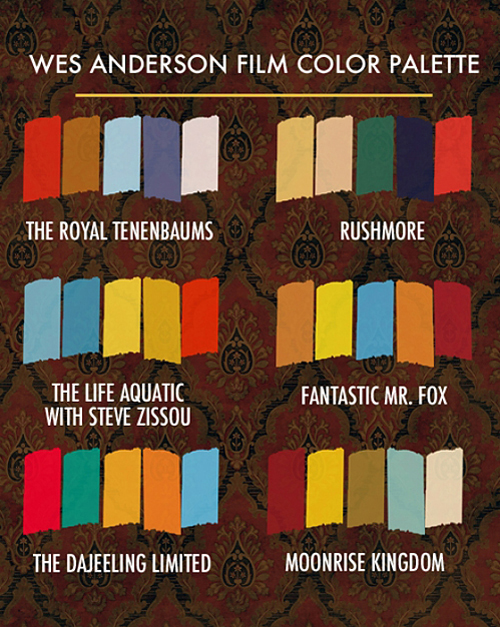
Last week I got a present in my inbox from my friend Sam. I recently saw Moonrise Kingdom and have been non-stop raving about it ever since. Knowing my affinity for camp, colorways and good branding, Sam passed this gem along from Beth Mathews’ blog. She did the tedious job of combing the color essence of each film then compiling the results (which are rather interesting). Feels like Autumn doesn’t it? Which one’s your favorite?


Tracking Repetitive + Awesome.
On Instagram.