Pattern Pulp

Friday Quick Links!


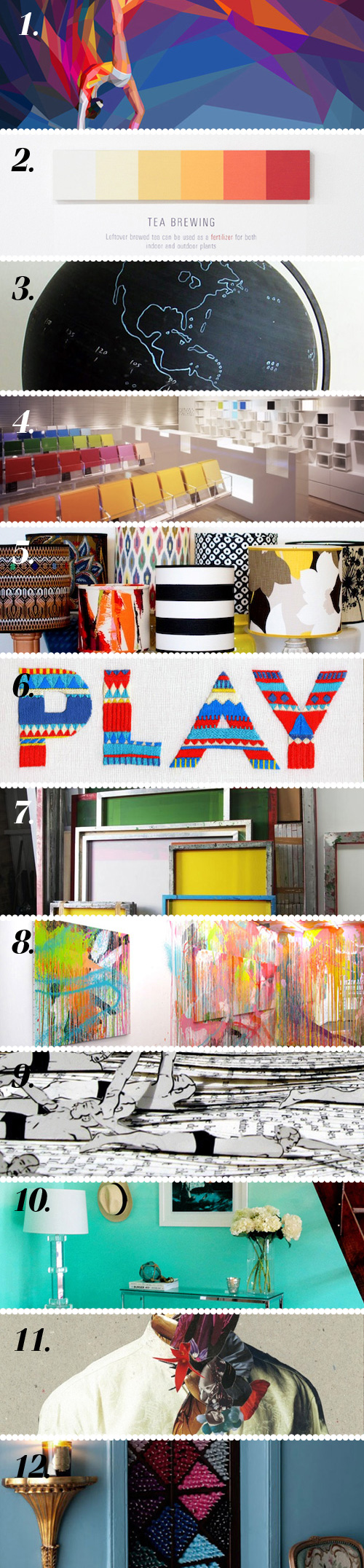
1. Olympic athletes depicted in Charis Tsevis’ unique technique via Patternbank
2. Documenting color changes in nature, pop culture, and elsewhere via Design Crush
3. Charming chalkboard globe via Miss Moss
4. Architect Emmanuelle Moureaux’s fantastic use of color via Aesthetics of Joy
5. See the light: learn how to make a lampshade via design*sponge
6. Interview with sisters Maricor and Maricar Manalo via The Design Files
7. Great behind the scenes look at screenprinting in fashion via Style Bubble
8. Who says the paint needs to stay on the canvas? via All the Mountains
9. Jennifer Koshbin’s latest book sculptures celebrate the Olympic sports via Poppytalk
10. Kind of in love with this ombré wall project via P.S. – I made this…
11. Enrico Nagel’s lovely “Secret Garden” collage series via The Artful Desperado
12. Love this patterned retail display of tapered candles via Plenty of Colour

Contributed by Emily Gup

Twitter Influencer: Lotta Nieminen


Lotta Nieminen is an illustrator, graphic designer and art director from Helsinki, Finland. She has studied graphic design and illustration at the University of Art and Design Helsinki and the Rhode Island School of Design, and has worked as a freelancer in both fields since 2006. After working for fashion magazine Trendi, Pentagram Design and RoAndCo Studio, Lotta is now a full-time freelancer based in New York City with an impressive client list that includes the likes of Hermès, New York Times, Volkswagen, United Airlines, International Herald Tribune, Monocle, Newsweek, Wired UK and Bloomberg Businessweek.

Since striking out on her own, she’s been earning awards, speaking at events around the world and has had her work in exhibitions, book and magazines. Her rising design star status can only be amplified by her lovely twitter feed. Expertly utilizing the medium, her friendly, cheerful personality and gracious manner shines as she shares her work, travels and thoughts with friends.


Book Review: Interaction of Color


If anything will remind you to appreciate the tangible wonder of books, it’s Joseph Albers’s Set, Interaction of Color. The new release of his original 1963 limited silk-screened edition is a chance for color lovers to own one of the most influential books on color ever published.

Lavishly produced as a two volume slipcased set, this book replicates Albers’s revolutionary exercises, explaining concepts such as color relativity and vibrating and vanishing boundaries through the use of color, shape, die-cut forms, and movable flaps.

Also included for the first time are new studies from the Albers archive, produced by the artist’s students in the early 1960s. Without a doubt, this gorgeous tome is a collector’s item for color and fine art book lovers.

Imagery via Apartment Therapy

Making Music with Sam and the Womp


Who remembers this post from April? The one about color, backdrops and photo trends? Today we’re translating those palettes to music and media with the London ska/dance trio, Sam and the Womp with their latest video, Bom Bom. 

The beat’s surprisingly catchy, isn’t it? I recently heard the tune off my husband’s laptop and fell for the video’s playfulness. It’s clear creativity works best on a budget, what do you think- are you a fan?


London: Economy of Attention


German artist Mike Meiré‘s latest exhibition, Economy of Attention, presents a series of  large-scale works on paper alongside ceramic sculptures that embrace the medium of newsprint and highlight its structural beauty.

His latest body of work follows a series of singular paintings on newsprint, which examines existing grids in newspaper layout and reflects on the prioritization of information through graphic design.

Meiré’s background as an art director along with his intrinsic understanding of this medium allows him to strip the compositions to a bare minimum.

Central to all of Meiré’s work is a delicate interplay between the highly refined and mundane everyday materials. The juxtaposition of organic and often sexually explicit or gender-orientated ceramic objects alongside anodyne geometric elements play an increasingly important role in Meiré’s work.

As one line of work continues to inform the other, Meiré’s paintings and ceramic sculptures reveal a profound understanding of popular culture. It is this knowledge, which allows the artist to explore the deep-rooted neurotics that inhibit today’s societies and in turn challenges these through his work. Click here for more info.

Bartha Contemporary Ltd.: 25 Margaret Street, London W1W 8RX


Mixing Watercolors & Photo Styling


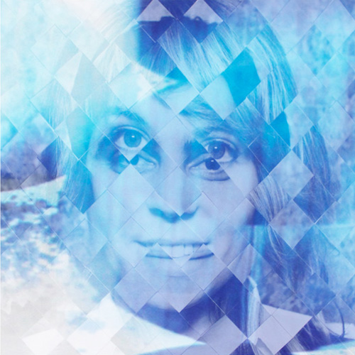
Watercolor-photo collages have been a mainstay for a while now. From soft lyrical lines to crisp geometrics, adult and youth brands have continued to incorporate the direction in both digital and tangible goods.

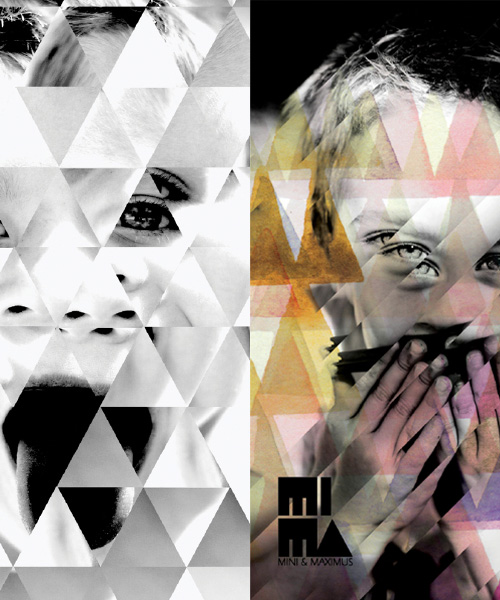
Case in point, Mimi & Maximus.  Always producing great clothing, it’s no surprise  their summer catalog is playful and visually engaging. The branding is compiled of triangles and photography- almost reminiscent of my wedding art from last spring!

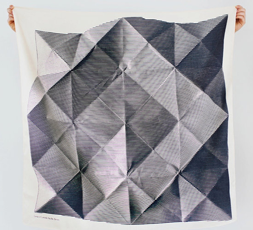
Meshing monochromes, folded imagery, depth and soft materials, The Link Collective, a Japanese-based Etsy shop is selling beautiful scarves with similar energy. Which leads me to ask- are you still a fan of the style? Are you ready for what’s next?


Tracking Repetitive + Awesome.
On Instagram.